2008 South Carolina Primary Map, Estimated White Vote
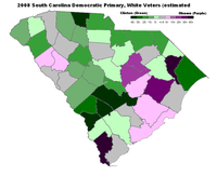
 This is an attempt to figure out where Barack Obama fared best among white voters in South Carolina. What I've done is estimate the racial composition of the electorate in each county by assuming (a) more or less all African-Americans are Democrats, and (b) the percentage of white voters that vote in each county will be roughly the same. If we then hold African-American performance constant, we can produce a number that represents the combination of Obama's over/underperformance among black voters and the margin of victory among white voters.
The green areas represent counties where Obama either underperformed among African-Americans, or lost the white vote, or both; the purple areas the reverse. Of the major cities, Obama's best performance was in Charleston, followed by Greenville, Columbia, Spartanburg, Rock Hill, and Myrtle Beach. Outside the cities Obama fared vest in the heavily African-American counties between Columbia and Charleston, fought to a draw in some of the Northwestern counties, and tended to lose the rural counties that were still majority white. His poorest performance was in the "corridor of shame" south of Columbia: Orangeburg, Bamberg, and Allendale counties are also heavily African-American. The light-pink spot in the Northwest is Greenwood, home of the "Fired up! Ready to go!" lady.
Update: I just want to be very clear: this map does not necessarily show where white voters went for Barack Obama. Purple counties might represent a strong white vote for Obama; or they represent above-average turnout from black voters; or they might represent areas where Obama earned 100% of the black vote. Green counties might represent might represent white voters' antipathy towards voting for Obama; or they might be counties where African-American voters were more likely to vote for Hillary Clinton; or they might represent counties where white voters make up a larger share of the Democratic electorate. We just don't know which is the case. Because South Carolina is required to track the race of its voters, we'll eventually have more accurate figures, but that's a month away.

This is a really, really interesting map. What great work!
Posted by: ikl | January 27, 2008 at 12:02 PM
A formula would be nice.
Posted by: Mike | January 28, 2008 at 11:57 AM
It's complicated, I can send you the formula.
The total result for a candidate looks like this
(black percentage of the population) * (black turnout rate) * (black preference) +
(white percentage of the population) * (white turnout rate) * (white preference)
We know the percentage of population values from the census. That leaves four variables: the turnout rates and preferences of blacks and whites. What I have done is hold the black turnout rate, black voter preference, and white turnout rate constant: 100% of African-Americans turned out, and 33.4% of white voters turned out. This mix woulc give the 45/55 white/black split that the exit polls show. Now, obviously, black turnout is not 100%, but if it drops proportionately, then white turnout must drop proportionately as well. And finally I held black voter preferences constant based on the exit polls (78% for Obama, 19% for Clinton, 2% for Edwards.)
Anyway, at this point we have one question with one unknown -- white voter preference, which we can solve for. So in one county, the white vote share for Obama is:
(total vote share - 1.00 * (percentage of county population that is black) * .78) / (.334 * (percent of population that is white))
The numerator is "white vote share out of the total electorate" and the denominator is "percentage of the electorate that is white".
Then you repeat the same process for Clinton, and take the difference.
Now, obviously this model has flaws. In particular, if there is significant regional variance in African-American voter turnout or voting preference, it will appear that white voters love or hate Barack Obama when they do not. But it is better than nothing.
Posted by: Nicholas Beaudrot | January 28, 2008 at 02:16 PM
Adding ... once the Secretary of State produces turnout numbers showing the number of white and black voters in each county, we can get a better handle on things.
Posted by: Nicholas Beaudrot | January 28, 2008 at 02:18 PM